20 May 2008

Testing Results

To evaluate how well the final Capstone Design Project was completed, it is important to test the final product. To test the project Graphic Designs for Seasons, surveys were handed out with the final products to both the clientele and customers. The results of these surveys were then analyzed and a conclusion on the outcome of the project was determined.

Testing Procedures
Two different surveys were created. One for the clientele to determined how happy they were with the final products, and one for customers to see how they responded to the products. The majority of the questions asked on both of these surveys were asked in the form of a scale of numbers. The person taking the survey would answer the question by rating the answer on a scale from 1 to 10. This allows for quantitative analysis which is easier to draw conclusions from than regular open-ended questions. The survey for the client, shown partially in Figure 1.1, mainly asked questions about being happy with specific products such as the business card, the symbols, the ads, etc. Also, at the end was room to add additional comments as well as room to write about any thing they would want to change over all. This was then handed to the client with the four menus, a half page ad, a full page ad, and a business card.

The second survey, which is shown partially in Figure 1.2, was created for customers to answer. This survey asked questions about how appealing the products were, how appropriate they are for the main theme, and how easy it was to read the products and well as use them. Part of this survey asked the customer to identify with an age group. This was done to see if the products overall were better targeted to a specific age group. These surveys, as well as the four menus, a half page ad, a full page ad, and a business card, were handed out to random customers at JavaMoonCafé in Manalapan during the restaurant hours. They were given the background information of the Capstone Design Project and the project itself prior to completing the survey.

Due to difficulties in handing out the surveys to random customers, and to the excitement of the completed product by employees of JavaMoonCafé in Manalapan, the customer surveys were also handed out to those that worked at the restaurant during the testing dates of May 13th and May 14th. Also, since only one set of menus were created as well as only one full page and one half page ad, surveys were given out one at a time.


Self & Design Evaluation

I. Scope of Project
The owners of JavaMoonCafé in Manalapan are looking to get out of the JavaMoonCafé franchise and start their own business called Seasons. As a new business, the establishment would need new graphic designs to represent itself on paper. Also, seeing as Seasons would be a restaurant, the business would also need menus created.


II. Description of Solution
For my project, I created four menus, each corresponding to a different season, a business card, and a half page and full page advertisement. These items included a wordmark which I also created as part of my project.


III. Discrepancies between Original Design and Final Solution
One major discrepancy that occurred during my project was due to printing errors. Although designed exactly to scale on the computer, when printed, the dimensions of the final business card and menus were slightly smaller than what they should have been. The final dimensions were approximately 1/8” off. The business cards were completed upon printing and no issues were encountered when completing the menus which provided steps after the printing process.


IV. Successes and Failures
One success of my project included using the software Jasc Paint Shop Pro 9 (Figure 2) to its full extent to create professionally looking graphics. A failure would be that when first creating the graphics for the menu, the resolution was set at 72 pixels per an inch when it should have been set at 300 pixels per an inch. Increasing the resolution of each image was time consuming but easily done.
Also, when I gave the menus to Staples to have them laminated, I never gave specific directions, nor asked how the end product would look. Because of this, the people at Staples cut the edges of the lamination themselves, presumably with scissors, and therefore also cut part of the menu. This caused the edges of the final menu to be, in some cases, crooked and even open.


V. What Was Learned From Failures
From my failures I learned to make sure the resolution on a document is at an appropriate number before working on it, and I learned to get the specific details and ask questions when working with an outside group that is performing a service for you. The next time I need something to be done, I need to clarify what it is I need and what.


VI. Learning that Occurred
From this project, I learned how to use many more aspects of the software, Jasc Paint Shop Pro 9, than what I knew existed. I also learned new terminology that applies to graphic design that helped me to better communicate with my mentor.


VII. Design Flaws in design
One of the design flaws occurs in some of the symbols of the wordmark on some of the menus. On the spring menu, the grey layer of the inside flower was never deleted and can be seen on top of the black inside lines (Figure 3.1). Also on the spring menu, the grey lines on all of the symbols are thicker than those of the other menus. On the autumn menu, the inner lines of both the leaf and flower were never thinned. The leaf symbol on all of the menus has a random drag line that was never purposely designed in the creation of the leaf symbol.(Figure 3.2)


VIII. Improvements in Personal Characteristics
Through this project my problem solving skills greatly increased. When I encountered the problem of the resolution being the wrong size, I assessed the situation and created a way to fix the problem in the least amount of time, without losing the quality of the image. The resolution of the “artwork” on the menus could be increased without completely distorting the imagery. The wordmark had already been flatten to the layer and when the resolution of the image was increased, the wordmark had looked choppy. So instead of redoing both items, I simply cropped the wordmark out of the picture, cloned the background, and reapplied the vector wordmark. I then learned to save both the flatten copy, and the un-flattened copy in case of another mishap.
My communication skills also greatly increased. Prior to this project, I would avoid having to talk on the phone to a stranger at all costs. This project forced me to call various places such as Staples and Office Max, making me more comfortable talking on the phone. Having to e-mail my mentor, who is a stranger I have never met, was also difficult for me in the beginning of this project. Towards the end of the project, I was able to e-mail him freely with any help that I needed.
The Capstone Design Project improved my organizational skills by forcing me to deal with large amounts of files and physical documents. I had a draw in the CAD lab to keep my stuff together in school, and all files on the computer were sorted into various folders so I knew where to find what I needed when I needed it without much confusion.

IX. Conclusion
I have successfully completed my Capstone Design Project with both success and failures. The failures I was able to fix and learn from which added to the overall amount of skill and knowledge I gained from participating in the project itself. Although design flaws may be evident, they do not take away from the main purpose of the final solution. I feel I have completed this project with maximum effort which resulted in gaining new skills as well as improving on already existed ones.

07 April 2008

JavaMoonCafe

JavaMoonCafe shown above

Design Brief


Design a set of graphic designs, which include a wordmark, business card, magazine advertisement, menu layouts and design, for the owners of Seasons restaurant by April.

Construction

The start of all documents


Working on the wordmark


Creating the symbols


Editing symbols


Painting the artwork for the menu


Setting up the business card


Editing text


The final business card


Creating a digital sketch of an advertisement for the client


Editing text on advertisement


Formating half-page advertisement

Final half advertisment


Using the object selection tool to help with spacing


Putting the menu together


Final front of the summer menu

15 February 2008

Selected Business Card With Revisions


The revision made to this business card is the the wordmark was made thicker.

13 February 2008

Buisness Card Alternative Solutions

The following business cards were presented to the client as either choices to choose from or ideas on a different one not shown. It was noted that fonts and colors could be changed.


One was chosen to be slightly edited and used as the final business card.

11 February 2008

Color Schemes

Each symbol from thge wordmark, on items such as the business card and flyer, can be a different color. The snowflake is expected to be in the blue family, the flower in the red/pink/purple family, the sun the yellow/orange family, and the leaf in the green family. Below are combinations of four colors, one from each of the needed family.


The color schemes will be presented to the client. Either one will be choosen or a new one will be created based on the following color charts:

04 February 2008

15 January 2008

Math & Science Report

Math & Science Report
Ashley Persie

Introduction

The project I have chosen for my Capstone Design Project is to create all necessary designs for the new business Seasons. I have constructed the menu, designed the graphics to appear as the background as the menu and have created a wordmark with corresponding symbols to be used on the menu, business card, and flyer. Math, science, and technology are all vital concepts that need to be looked at with the creation of this project.

The Wordmark
The wordmark (figure 1.1) spells out Seasons. The larger ‘S’ is 612 pixels tall, and the ‘easons’ is 221 pixels high resulting in an approximately 3 to 1 ratio of letter size. This ratio allows the first ‘S’ to stand out without hindering the presence of the rest of the word so that the whole word is represented with an emphasis on the first S. The average letter width of the ‘easons’ is 168.8. The wordmark has a 23 to 12 pixel ratio. The wordmark can be made any size and as long as it is kept to the same proportions it will look exactly the same.


The appearance of the wordmark on the menu will be black. The science behind this is that, since black is the absence of all color, it will stand out in front of any light colored background. Since the menu covers are different shades of light blue, the boldness of the black will allow the wordmark to catch the viewer’s attention. Another reason for the wordmark being black is that is it were any other color, it would blend in with the rest of the color, which depending on the season the menu is depicting, can show an array of seven different colors. Figure 1.2 shows examples of how the wordmark would look as different colors on the menu and why it black is the best choice.


The technology used to create the wordmark was the software Jasc Paint Shop Pro 9. Specifically used was the pen tool which has the ability to create vector graphics. Vector graphics are images that are created using geometric principles such as lines and curves. These kind of graphics are considered best for wordmarks and logos because they don’t lose detail when resized or printed at different resolutions. Most of the letters consist of Bezier (or point-to-point) curves or are modified eclipses.


The Symbols
There are 4 symbols (figure 2.1) that go along with the wordmark to represent each season. Each are the same height of 154 pixels and vary by width from 157 pixels to 161 pixels. They are lined up and centered 20 pixels above the ‘easons’ in the wordmark and are spaced 11 pixels from end to end. Both the sun and the snowflake hold rotational symmetrical properties around the center point. The leaf is also symmetrical but against a single axis through the center of the leaf. The flower holds similar characteristics to rotational symmetry but each petal is unique in design.


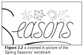
The science behind the color choice of black on the menu is the same reasoning as the black used for the wordmark mentioned previously. However, since each menu emphasizes one symbol, so should the wordmark symbols. To accomplish this, I made the symbol that corresponds to the menu season black, and all of the other symbols grey (figure 2.2). In addition to being grey, the 3 symbols are also incomplete. I am able to do this because of character recognition. Character recognition is the ability of the mind to know what something is, without seeing all of it.


Color
The menu designs (figure 3.1) were also created using the Jasc Paint Shop Pro 9 software. The software, and many other computer programs for that matter, uses hexadecimal codes to determine different color values. Hexadecimal codes are composed of 6 numbers. The first two numbers represent red, the second two represent green, and the last too represent blue. These six numbers are put after a pound sign so that you end up with #RRGGBB. Each set of two characters range from the numbers 00 to 99 and the letters AA to FF, FF being the most of that particular color and 00 being the least, or none, of that color. For example, the color red in hexadecimal coding is #FF0000. The color is white if all colors are represented with ‘FF’s’ and black if all colors are represented with 00’s. Hexadecimal codes can be as complicated at #cde583. Figure 3.2 shows an example of a hexadecimal code color chart.


Commercial Printing Technology
The menu designs that were created for my project will be formatted to the constructional design that was made (figure 4.1) and then printed. Technology in printing goes back to the mid-15 century when Gutenberg patented the printing press. This was done with movable type which are letters carved out from wood, brushed with some form of an ink, and then pressed to a paper(2). Before this time, all publications were written. Since then, the printing press has advanced immensely. There are many different types of printing processes including screen printing for t-shirts and thermography for raised printing, common in stationary. Most commercial printers use a process called offset lithography. First the document is converted into plates. This is done by adjusting light exposure to the plate. When light hits the plate, chemicals react onto the plate causing the image to appear. Each primary color, black, cyan, yellow, and magenta, has its own plate. The plates are added to the printing machine. A printing machine can use either precut paper, or a large roll of continuous paper (figure 4.2). The paper is fed in between two rollers. The top roller holds the plates. This roller is dampened with water and then the ink is applied. Because ink and water do not mix, the ink transfers completely to the paper. There are usually four or five rollers, one for each of the primary colors, and a custom one if need be. To avoid smudging of the wet ink, the paper is then passed through an oven. This process goes extremely fast, approximately 50,000 impressions per an hour. The large roll of now printed paper is sent to the bindery where the paper is cut to size and put together into the final project(3).


Conclusion
The completed design of my project will have included math, science, and technology. Technology in printing and software is evident most out of the three. Science is represented through the different colors of my project as is math in sizing and spacing of each of the graphics.


Citations
1 Funky-Chickens HTML Help. 10 Jan. 2008 .

2 "Manuscripts, Books, and Maps: the Printing Press and a Changing World." UCSD. 10 Jan. 2008 .

3 Mark Mine. "How Offset Printing Works". March 02, 2001 http://computer.howstuffworks.com/offset- printing.htm (January 11, 2008)